
New BU Logo - No More Tradition and Half the Scholarship
The Bishop's University brand standards have undergone substantial changes in 2007. I generally like the new look of things, but there is one particular change that is in my opinion inappropriate: the change of the Bishop's logo. It would appear that both the university and the image consultants it has hired (for good money) have failed to do their homework on this one.
I noticed the whole thing awhile ago, but for one reason or another I failed to pursue the matter. The real discussion on the matter has been started by Dr. Catherine Tracy from Classical Studies. It is Dr. Tracy who is the source of most of the information below (especially the heraldic information she discovered after a dialogue with the Canadian Heraldic Authority).
Half the Scholarship
The university logo used to look like this:
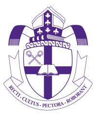
In 2007 it has been replaced by the following:
![]()
You will easily see the heavy simplification that has gone into the new logo. Unfortunately, the simplification causes it to loose about all of its meaning. In particular you will notice that the Latin motto is no longer there but the (now empty!) motto scroll is kept;as some of my colleagues have pointed out, this can only imply that our mission statement is empty!
The book just underneath the mitre is also an important symbol of an institution of higher learning. The disappearance of said book in the new logo is therefore equally appalling, though fortunately the open book in the middle has been kept (one out of two; it could have been definitely worse).
Overall, I find the new logo to have lost its meaning completely. Our image is now a doodle.
No More Tradition
The pre-2007 logo has actual heraldic significance. It is itself a simplification of the official Bishop's University Coat of Arms (which appears rarely nowadays, only on documents produced for special occasions such as the Convocation). Our full Coat of Arms looks like this:
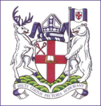
This simplification however is correct. Apparently heraldry allows for some flexibility in interpretation as long as the essential content is not removed. Our pre-2007 logo is different from the illustration on the letters patent document that formally granted the university arms, but is still an entirely valid version.
According to the Canadian Heraldic Authority the arms can be drawn in various ways, but they always have to include the open book, the cross and the croziers; the crest can be drawn in various ways, but it always has to include the mitre, the maple leaves and fleurs-de-lis on the orphreys, and the book. Therefore the new logo is no longer the Bishop's University coat of arms, which is a pitty.
Dumbing Down the University Image
In principle I am all for simplifying things, but this is in my book too much simplification. I believe that the 2007 changes have dumbed down our image. I also believe that this is the wrong way to go for a university and that the changes send the wrong message to our potential students. Indeed, dumbing down seems to be the exact opposite of higher learning…
